

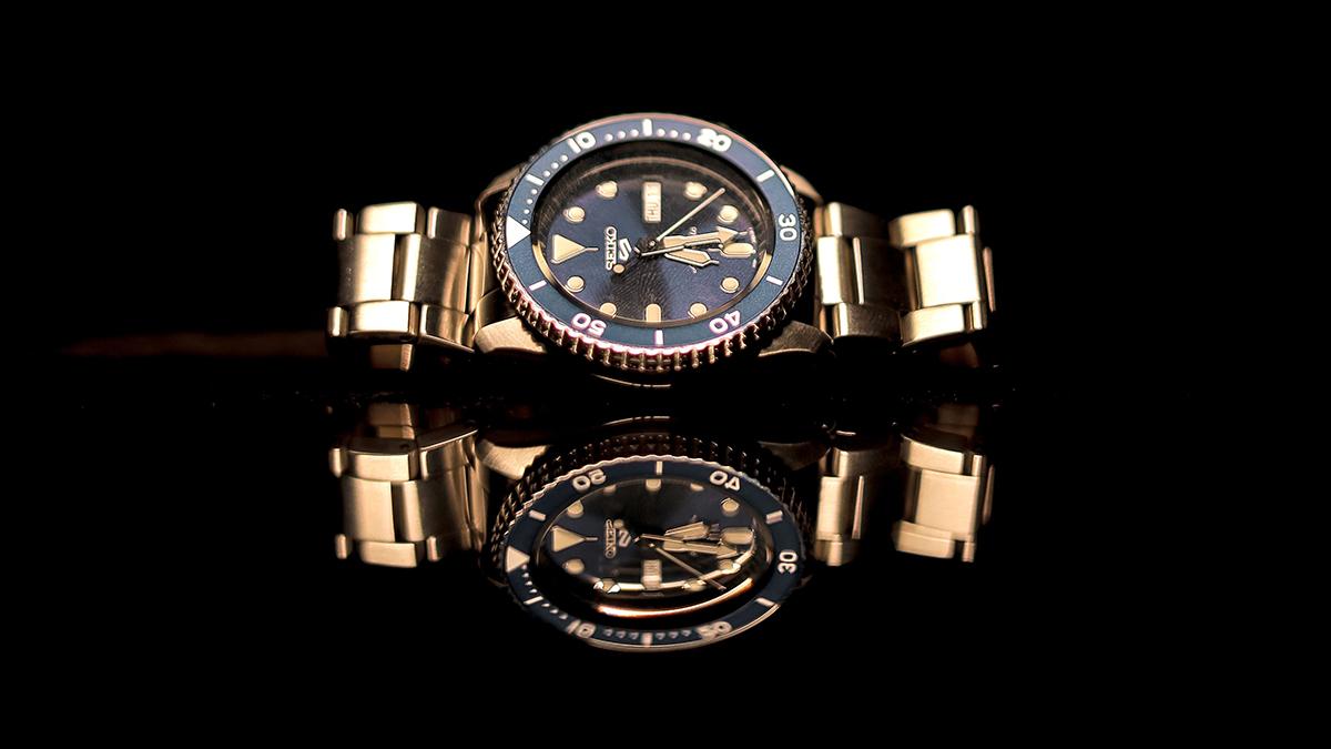
A watch is one of the few objects we wear that is both intimate and architectural. Its scale is small, yet every surface has a voice: a satin-brushed case feels calm, a polished bezel catches attention, and a soft leather strap adds warmth. Before the logo or complication is noticed, material and finish have already created an impression.
That is why material choice deserves more attention than trend forecasts alone. A thoughtfully made watch does not simply borrow the language of luxury; it turns raw substances into proportion, texture, light, and comfort. Collections presented by specialists such as Rylan Watches also reveal how the same broad design category can shift in character when its case, bracelet, dial, or crystal changes. The most personal choice is often not a brand name, but a combination of details that feels natural on the wrist.
Craftsmanship Lives in the Transitions
Fine watchmaking is easy to associate with movements, but exterior craftsmanship is just as important to the wearing experience. Look at the boundary where a brushed lug meets a polished case flank, the narrow edge around a bezel, or the way bracelet links articulate without appearing loose. These transitions require control. When they are crisp and consistent, even a familiar material can feel elevated.
The reverse is also true. A premium-sounding material cannot compensate for uneven finishing, sharp edges, weak alignment, or proportions that fight one another. Craftsmanship is the editing process that makes every component belong to the same visual idea. Luxury, in this sense, is less about excess than resolution: nothing looks accidental, and nothing interrupts the experience.
Materials Speak Before the Brand Name
Steel and titanium: two different kinds of confidence
Stainless steel remains watchmaking’s great all-rounder. It can be sporty or formal, restrained or expressive, depending on how its surfaces are treated. Broad brushing makes a case feel purposeful; mirror polishing adds ceremony; alternating finishes bring depth to a bracelet. Steel also has a reassuring density that many wearers associate with permanence.
Titanium communicates something different. Its lighter weight and muted gray tone often create a more technical, contemporary mood. That low weight can be especially appealing in larger cases, where visual presence does not need to become physical burden. A practical guide to watch materials can help separate the name of a material from the component, finish, and construction that ultimately determine how it looks and wears.
Ceramic, gold, and carbon: stronger personalities
Ceramic is prized for saturated color, a smooth surface, and resistance to everyday scratching, although it can still chip under a hard impact. Gold and gold-tone finishes bring warmth and immediate visual richness, while carbon and composite constructions suggest speed, engineering, and modern performance. None is automatically more stylish than steel; each simply enters the room with a stronger point of view.
The key is restraint. A bold material works best when the rest of the design gives it space. A black ceramic case may need a clean dial; a warm metal tone can feel more sophisticated beside a quiet strap; a carbon texture benefits from disciplined typography. Personal style becomes visible through what is left out as much as what is included.
Straps and Bracelets Change the Message
A strap is not an afterthought. Leather introduces softness, variation, and the promise of a patina that records wear over time. A metal bracelet makes the watch feel more continuous and architectural, especially when the first links flow directly from the case. Rubber has its own design intelligence: it can reduce visual formality, add color, and make a substantial watch feel more relaxed.
Comfort is part of aesthetics because discomfort changes behavior. A beautifully proportioned watch that stays in a drawer has little relationship with personal style. Link articulation, clasp shape, strap flexibility, and weight distribution determine whether a watch becomes a daily signature or an occasional object.
The Dial Is a Material Landscape
The dial may occupy the smallest area, but it often carries the greatest emotional charge. Sunburst brushing moves with the light. Lacquer creates depth. Matte surfaces emphasize clarity, while applied markers introduce tiny shifts of shadow. Even the crystal changes the composition: its shape and anti-reflective treatment affect how directly the wearer can connect with the dial.
Here again, craft is measured in relationships. Hands should be legible against the background; indices should match the case’s level of refinement; date windows and subdials should feel integrated rather than added. The best dials reward both a quick glance and a closer look.
Patina Makes Time Visible
Some materials are valued because they resist change; others become more expressive through it. Leather darkens at the edges, bronze develops a surface patina, and brushed metal gathers fine marks that soften its initial precision. These signs of use can make a watch feel more personal, provided the aging is understood and cared for rather than mistaken for neglect.
That evolving surface is one reason watches become emotional objects. They do not merely accompany style; they record it. The scuffs from travel, a replaced strap, or the gentle polishing of a clasp can turn a manufactured object into a biography in miniature.
Choose by Sensation, Not Symbol
A useful way to choose a watch is to begin with sensation. Do you prefer weight or lightness, brightness or restraint, smooth surfaces or visible texture? Do you want the watch to settle into your routine or punctuate it? These questions are more revealing than asking which model appears most impressive in a photograph.
It also helps to compare dimensions, finishing, and practical ownership details with the same care given to appearance. Well-organized watch guides can provide context, but the final decision should return to the individual object: how the materials are used, how the proportions meet the wrist, and whether the design reflects the way you actually live.
The Most Luxurious Detail Is Coherence
A compelling watch does not need every prestigious material at once. It needs coherence. Case, dial, crystal, bracelet, and clasp should support one another, while finishing turns those parts into a unified experience. When that balance is right, craftsmanship becomes visible without explanation – and personal style feels less like display than recognition.